Colour plays a powerful role in an autism-friendly sensory room design, influencing how individuals feel, behave and interact within a space. For people across the autistic spectrum, the choice of colour can be an instrumental tool in creating a calming, supportive environment that promotes emotional regulation and reduces anxiety.
In this blog, we’ll explore the top five padding colours ideal for autism-friendly sensory rooms, dive into colour theory and their impact on moods and behaviour, and share practical tips on how to use them effectively to create an inclusive, sensory space.
Colour Psychology in Autism-Friendly Sensory Room Design
Before choosing padding colours for an autism-friendly sensory room design, it’s important to understand colour theory – particularly how colour perception differs for autistic children and adults.
How Colour Psychology Affects Neurodiverse Individuals
Colour psychology suggests that different hues and tones can influence mood and behaviour, with colours often perceived in varied ways. But how might these perceptions vary for neurodiverse individuals?
The human brain already dedicates significant resources to visual processing. However, in autistic individuals, this visual processing activity can be heightened. Increased activity in areas of the brain responsible for visual input can lead to visual hypersensitivity, meaning sights, patterns and colours may feel amplified or overwhelming.
Colour Sensitivity in Autism
Research into colour perception in autism indicates that:
Bright, intense colours can feel overstimulating
Highly contrasting colour schemes may cause distraction or discomfort
Softer, muted and natural tones are often more calming and supportive
In 2016, a study of 29 boys with ASD and 38 typically developing boys (ages 4–17) found that those with ASD preferred green and brown, whereas typically developing boys preferred yellow. This difference is thought to stem from sensory hypersensitivity in ASD, making yellow seem overwhelming.
These findings highlight the importance of carefully selecting sensory room colours to reduce overstimulation and promote emotional regulation.
Hypersensitivity vs Hyposensitivity in Autism
It is important to recognise that autism is a spectrum, and sensory processing differences vary between individuals.
Hypersensitive individuals may benefit from calm, neutral, earthy or pastel tones that reduce visual stress.
Hyposensitive individuals, who experience reduced sensitivity to visual input, may benefit from brighter or higher-contrast colours to increase engagement, social interaction, and sensory stimulation.
Understanding whether a child or adult presents with visual hypersensitivity or hyposensitivity is key when designing an effective autism sensory room.
Calming vs Stimulating Colours in Autism-Friendly Sensory Rooms
An essential element of colour selection in autism-friendly sensory rooms is understanding the difference between calming and stimulating tones — and how each impacts sensory processing in autistic children and adults.
Calming Colours for Hypersensitivity and Emotional Regulation
Calming colours such as soft blues, muted greens, and neutral earthy shades are widely recognised for their ability to reduce anxiety, lower stress levels, and minimise sensory overload. In sensory room design, these tones help create a controlled, predictable environment that supports emotional regulation and wellbeing.
For autistic individuals who experience visual hypersensitivity, overstimulation can make learning, therapy, and social interaction challenging. Gentle, low-saturation colours reduce visual intensity and limit potential sensory triggers, making them ideal for:
Self-regulation spaces
Therapy and intervention rooms
SEN classrooms and learning support environments
Quiet zones within multi-use sensory spaces
By incorporating soothing hues, designers can create a safe and calming sensory room that encourages focus, engagement, and emotional stability.
Stimulating Colours for Hyposensitivity and Engagement
In contrast, carefully selected stimulating colours can be beneficial for individuals with visual hyposensitivity, who may require increased sensory input to remain alert and engaged.
Warmer tones — such as soft yellows, peach, and muted oranges — can gently boost energy levels, encourage interaction, and enhance social confidence when used thoughtfully. The key is avoiding overly harsh, highly saturated shades that may become overwhelming.
Stimulating sensory room colours are particularly effective in:
Active play areas
Social interaction zones
Engagement-focused therapy spaces
Sensory integration activities
When balanced correctly, these warmer tones can enhance attention, participation, and sensory processing without causing overstimulation.
Things To Consider When Choosing Your Sensory Room Colours
When designing your sensory room, colour theory is an important consideration, which we incorporate into our bespoke designs, through our expansive selection of padding colours.
In order to best accommodate the users of your space, whether this is one individual or a group of users, it’s important to consider their specific needs, abilities and triggers in order to determine the best colours to incorporate. Ultimately, creating the best possible user experience.
When a space is used by individuals with diverse needs, fully tailoring it to everyone can be challenging. Using neutral tones for walls and floor padding provides a versatile foundation, while incorporating smaller pops of colour through sensory equipment and loose sensory toys allows for easier adjustments based on who is using the space at any given time.
Ways To Incorporate Colour Effectively:
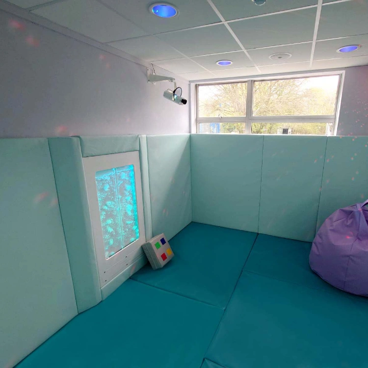
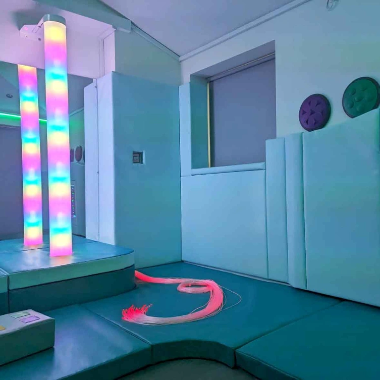
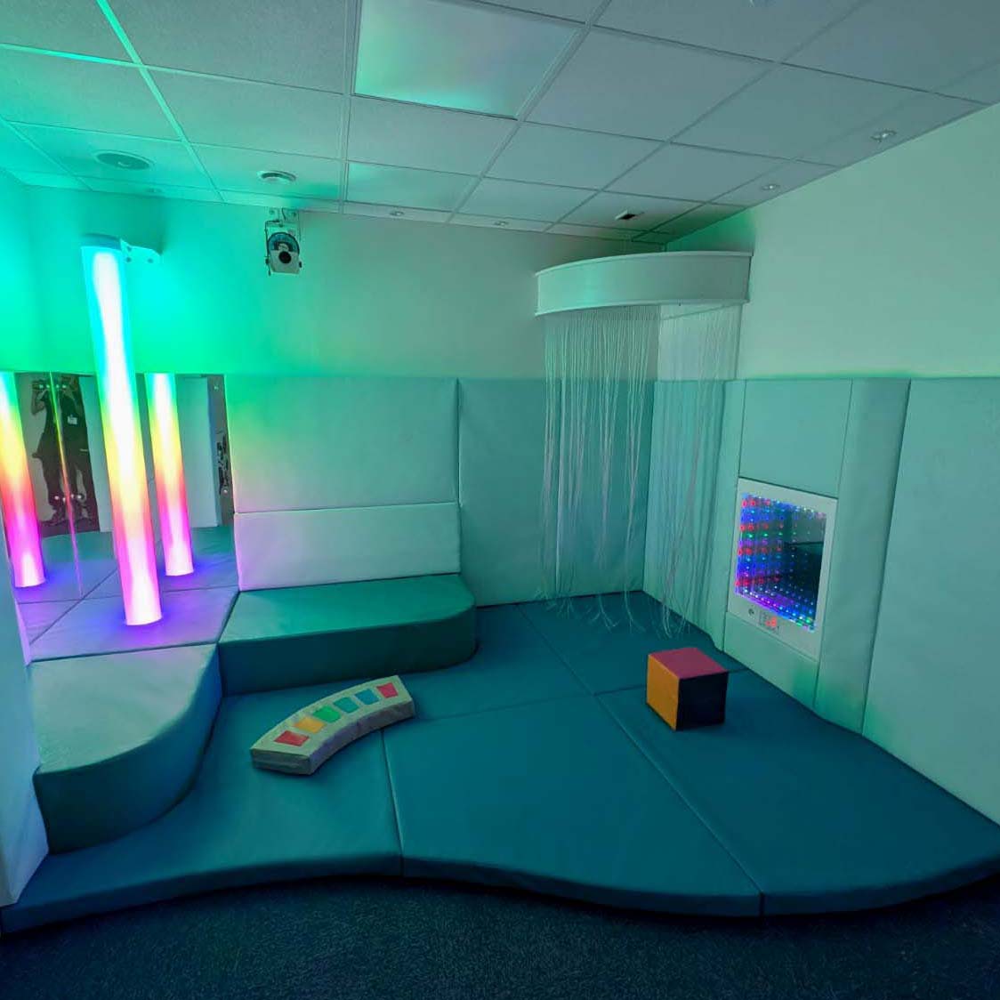
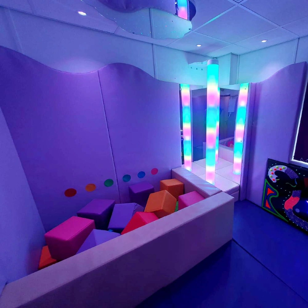
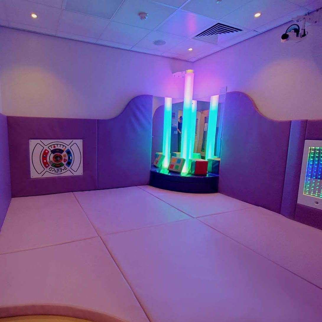
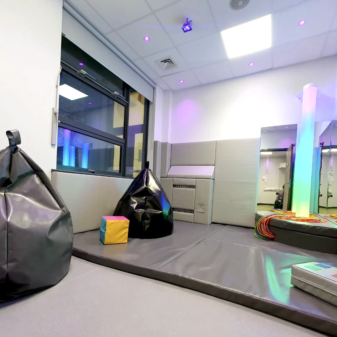
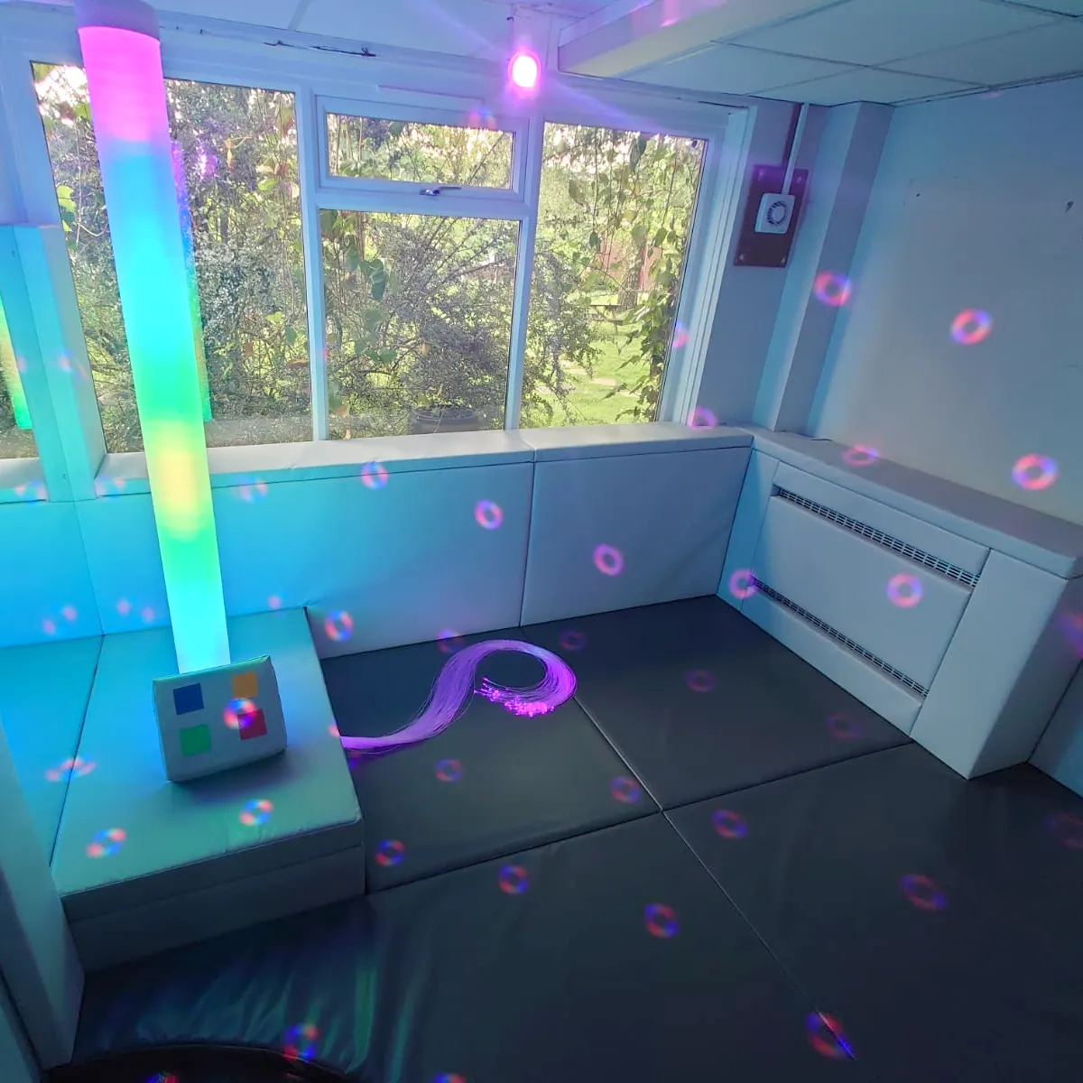
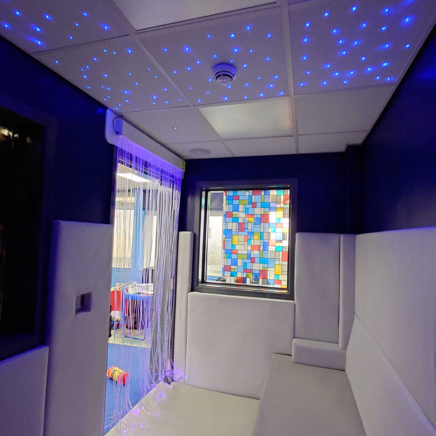
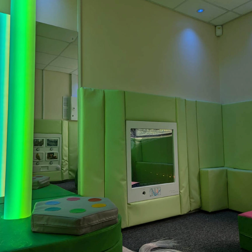
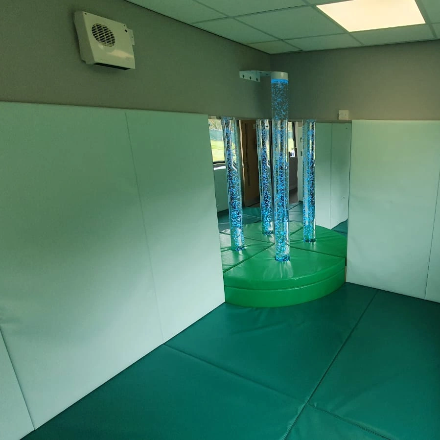
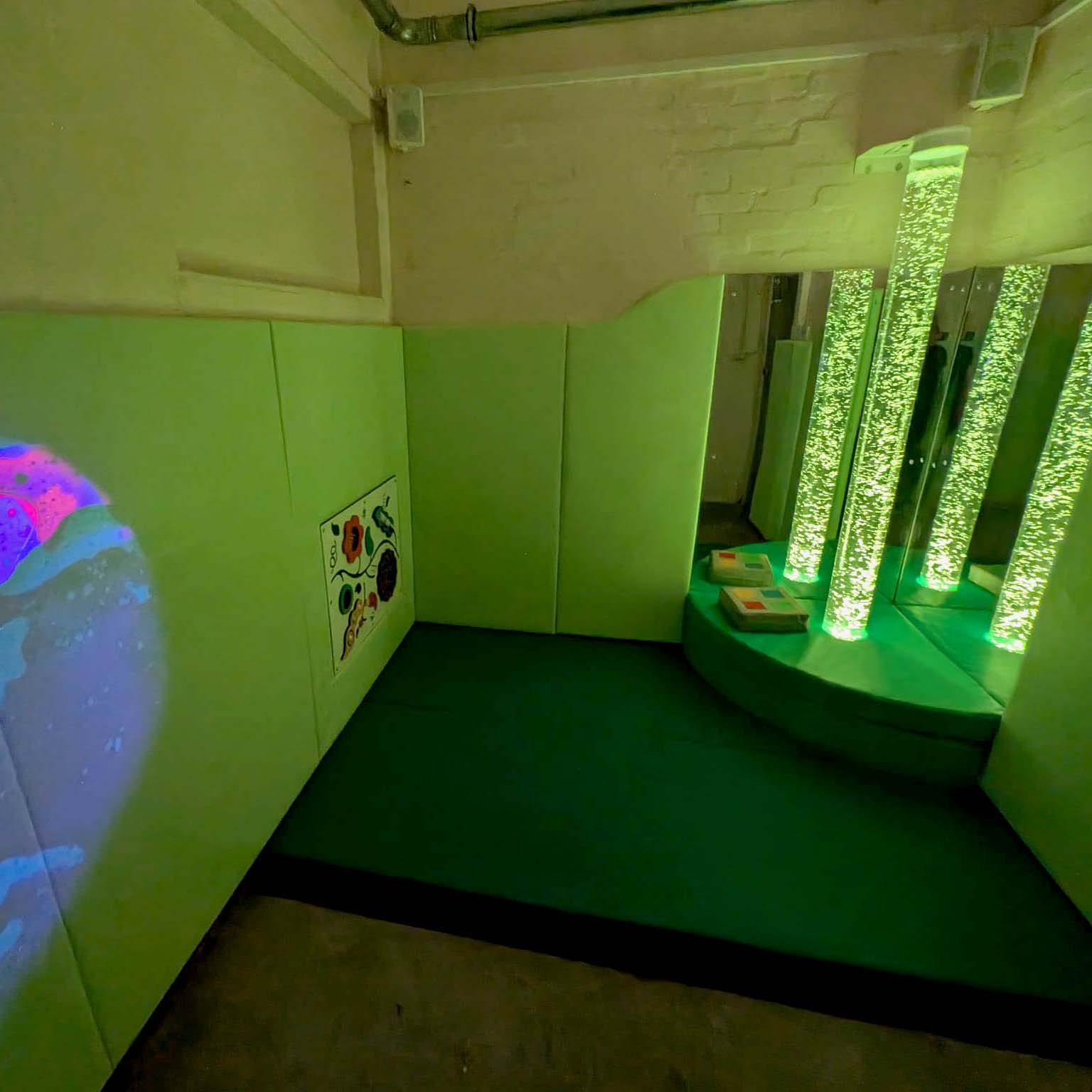
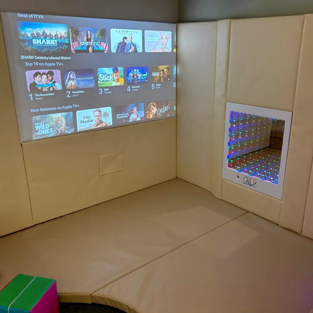
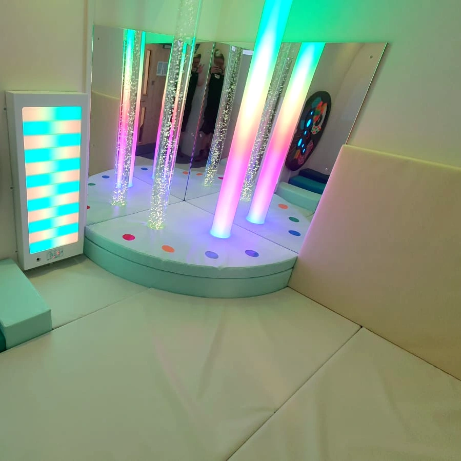
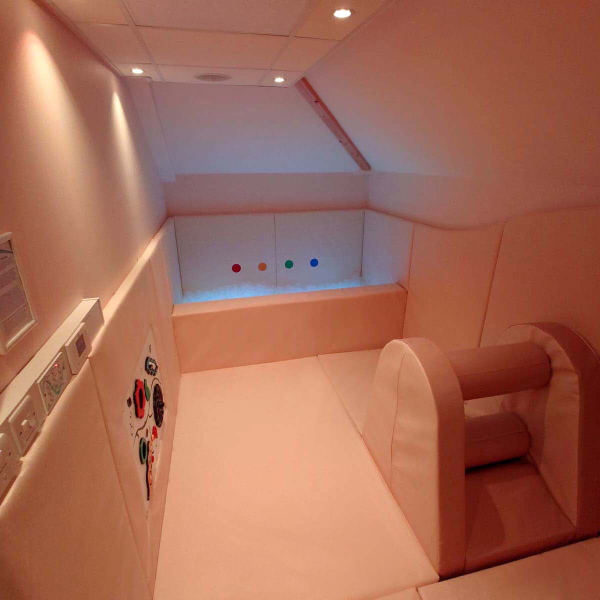
- As displayed in the images above, colours can also be combined to amplify the calming setting and aesthetics of the room. During the sensory room design process, our sales and design team work closely with clients to understand specific colour requirements (e.g. brand or school colours) whilst also ensuring the colour choices align with the intended sensory experience.
- For wall paints, lighter shades such as white, grey, or magnolia are often recommended, as they reflect light better and contribute to a more open and peaceful feel.
- If you’re looking to create a multi-sensory space, you may want to consider dividing the room into zones that reflect different sensory goals. For example, areas intended to stimulate should feature brighter, more vibrant colours, while zones designed for calm and relaxation should showcase softer, more neutral tones.
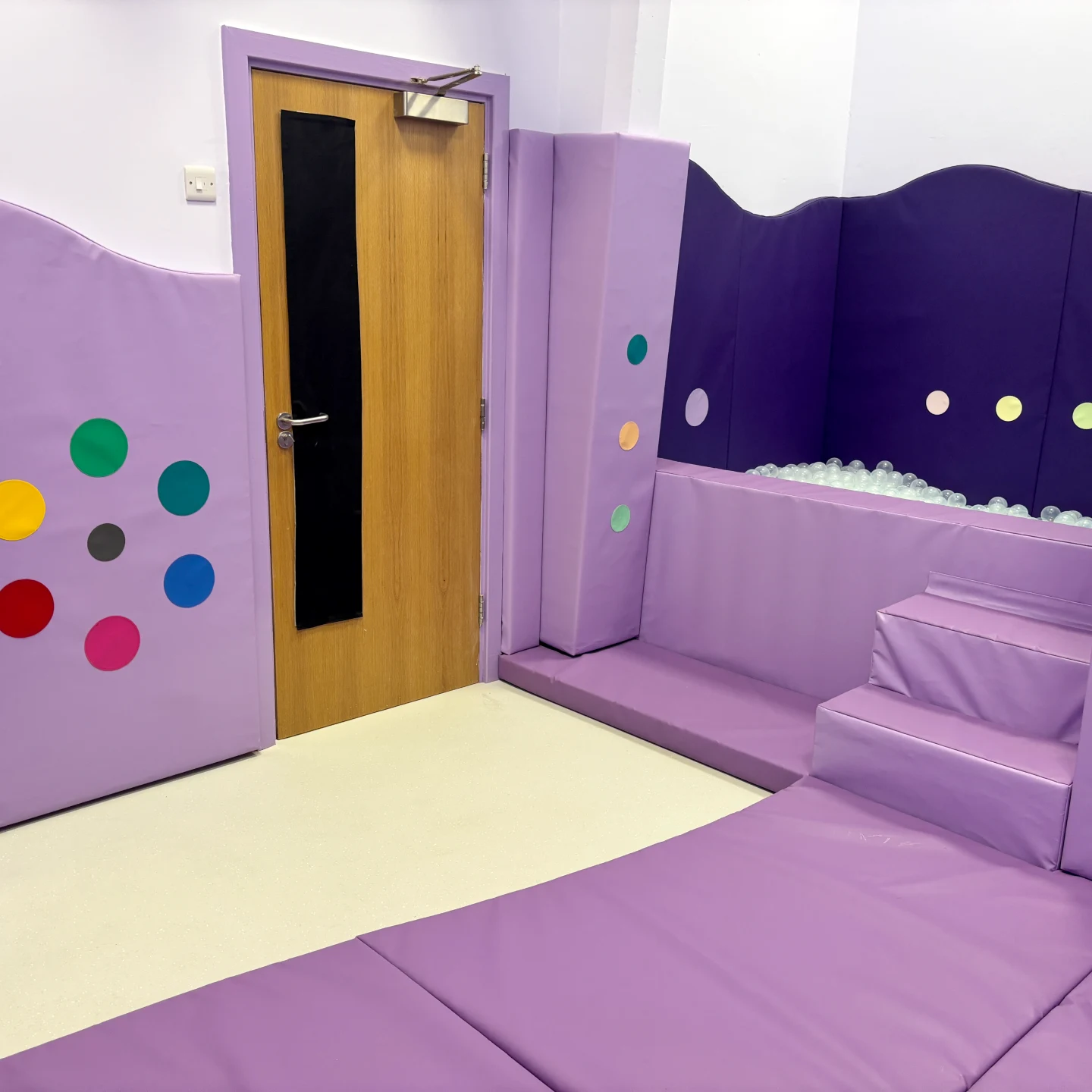
Selecting Your Padding Colours - The Power of Pastels and Neutrals
At Sensory Technology, we offer a wide range of protective padding colour options, including our exclusive collection of pastel and neutral tones.
Beyond enhancing the visual appeal of a sensory room, these calming shades play a key role in creating a soothing and supportive sensory environment. From pastel shades of Lilac and Mint, to neutral shades of Creams and Greys – we can help you create the ultimate autism-friendly sensory experience.
Unsure of which colours to choose for your autism-friendly sensory room? Contact a member of the team for a free design and consultation.
